More options can make a product feel more appealing, but when users struggle to understand the differences, choice quickly turns into friction.
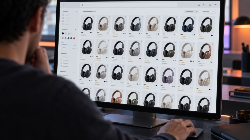
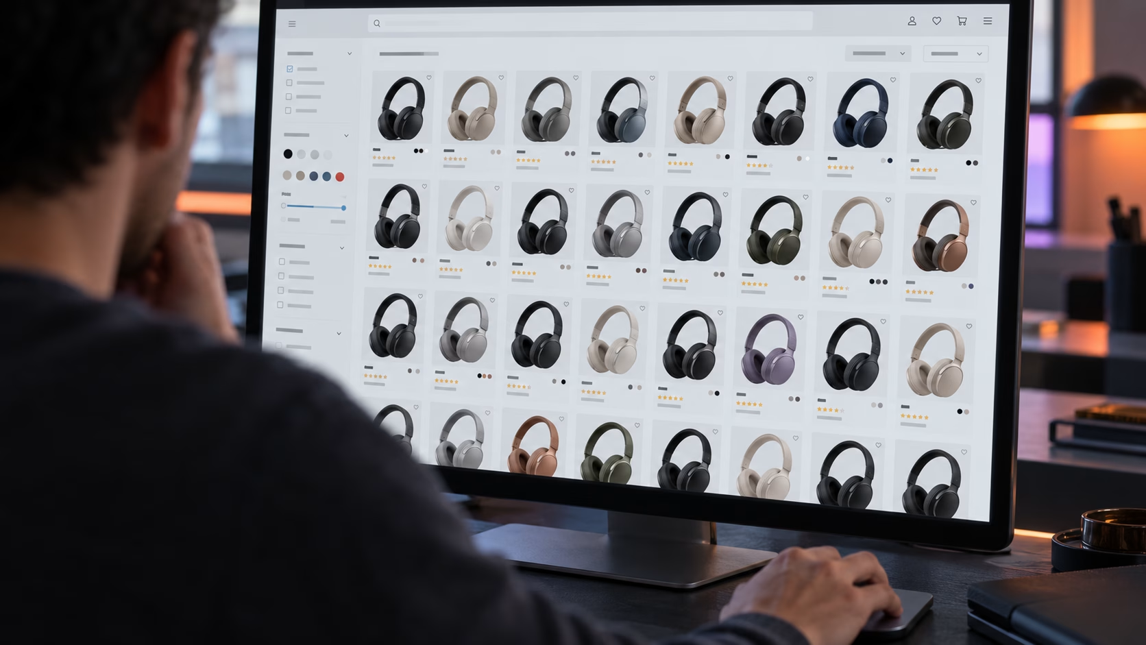
Imagine visiting an online store to buy a pair of wireless headphones. You find 30 different models, many with similar features, prices and customer ratings. You open a few product pages, compare specifications, return to the product list, and start wondering if another model might be better.
What should have been a simple purchase now feels like a research project. Eventually, you leave without buying anything.
This is a familiar example of the paradox of choice in UX. Offering more options may seem like a good way to satisfy different customer needs, but when those options are difficult to compare, they can create confusion, hesitation, and unnecessary effort.
For businesses, this can become a conversion problem. Good UX helps visitors understand their options and make decisions with confidence.
What Is the Paradox of Choice in UX?
The paradox of choice describes a situation in which having more options, instead of making a decision easier or more satisfying, can make it harder to choose.
Psychologist Barry Schwartz popularized the concept in his book The Paradox of Choice: Why More Is Less. The central idea is that while having options gives us freedom, evaluating too many alternatives can sometimes lead to frustration, uncertainty, and decision paralysis.
In UX design, this becomes particularly relevant when users face large product selections, complicated navigation menus, multiple pricing plans, or several competing calls to action.
However, more choice doesn’t automatically mean a worse user experience.
Research into choice overload has produced mixed findings, suggesting that the difficulty of a decision depends on factors such as how options are presented, how similar they are, and how familiar users are with the available choices.
A 2010 meta-analysis published in the Journal of Consumer Research reviewed 50 experiments and found no consistent overall effect of choice overload, although results varied considerably between studies. This reinforces an important UX principle: the way choices are organized and presented can matter as much as the number available.
Why Too Many Options Can Make Decisions Harder

When users face a large number of choices, the difficulty isn’t always finding something they like. Sometimes, it’s deciding which option is worth choosing over the others.
Several psychological factors can contribute to this hesitation, especially when websites provide little guidance.
Decision paralysis: When choosing feels like work
When several products have only minor differences, identifying the best option can become surprisingly difficult. Users may keep comparing alternatives without feeling confident enough to choose.
This is known as decision paralysis, where the effort involved in evaluating options causes people to delay a decision or avoid making one altogether. In e-commerce, this can mean visitors repeatedly opening product pages, returning to search results, or abandoning a purchase because they aren’t confident enough to proceed.
Cognitive load: Too much information to process
Cognitive load in UX refers to the mental effort required to process information and complete a task.
When websites present too much information at once, such as dozens of product specifications, crowded navigation menus, or competing buttons, users may struggle to identify what deserves their attention. The problem becomes worse when they must remember information from one page while comparing it with another.
Good UX reduces unnecessary mental effort by making important differences visible, grouping related information, and helping users compare options without relying on memory.
Fear of making the wrong choice
More options can also introduce an irritating question: What if there’s something better?
This uncertainty can be particularly noticeable when choosing expensive products, software subscriptions or services that involve a long-term commitment.
Clear product comparisons, honest recommendations, transparent pricing, and relevant customer reviews can help address this uncertainty.
Where Choice Overload Appears in Website Design
Choice overload isn’t limited to online shopping. It can appear anywhere users need to compare options, navigate information, or decide what to do next.
Some of the most common examples involve product listings, website navigation, pricing plans, and calls to action.
Ecommerce Product Categories With Too Many Similar Products
A large product catalogue isn’t necessarily a problem. The difficulty begins when customers cannot easily distinguish one product from another.
Imagine browsing 30 wireless microphones that look almost identical. If every product card displays only a name, price, and star rating, shoppers have little information to narrow their selection.
They may need to open multiple product pages just to compare basic details such as battery life, noise cancellation, or comfort.
Navigation Menus With Too Many Competing Paths
Website navigation can create similar problems. A menu with dozens of links, overlapping categories, or vague labels forces visitors to figure out how the website is organized before they can find what they need.
Even visually impressive navigation can become frustrating when creative interactions make familiar actions unnecessarily complicated.
For example, labels such as Discover, Explore and Experience may look interesting, but they provide little indication of where each link leads.
Pricing Pages and Competing Calls to Action
Choice overload can also affect websites selling services, subscriptions, or software. When pricing plans contain long feature lists with poorly explained differences, visitors may struggle to understand which option suits their needs.
The same applies to pages filled with competing calls to action, such as Get Started, Book a Demo, Contact Sales, and Learn More, all given equal visual importance.
The common problem across these examples isn’t the availability of choice. It’s the lack of guidance that helps users decide what matters.
How to Reduce Choice Overload Without Limiting User Freedom
Reducing choice overload doesn’t mean removing products, features, or useful information from the product page. The goal is to make decisions easier by helping users focus on what matters at each stage.
Here are four practical ways to achieve this.
Prioritise Choices Through Visual Hierarchy
When every button, product, or message looks equally important, users have to work harder to figure out where to focus.
A clear visual hierarchy helps guide attention through thoughtful use of spacing, typography, contrast, and positioning.
For example, a service page might feature one prominent Request a Quote button, while supporting links such as View Our Work remain visible but less prominent. The secondary options are still available, but users can immediately recognize the main action.
Use Filters and Categories to Make Large Selections Manageable
Useful filters allow shoppers to narrow a large selection according to their actual priorities. Buyer criteria are far more helpful than forcing them to browse dozens of models individually.
Categories should also reflect how customers think about products, rather than relying entirely on internal product classifications.
The aim is to help users reduce the number of options they need to evaluate, not the number of options they can access.
Help Users Compare What Matters
A comparison table can make the process easier by presenting important features side by side, rather than requiring visitors to remember details from several pages.
Descriptive labels such as Best for Travel or Suitable for Small Spaces can also provide useful context, provided those recommendations are supported by actual product characteristics.
The same principle applies to pricing pages. Instead of presenting three plans with long, nearly identical feature lists, highlight the differences that genuinely influence a purchasing decision.
Reveal Complexity Progressively
Progressive disclosure is a UX approach that presents essential information first while allowing users to access additional details when they need them.
For example, a product page might display key specifications upfront, with more technical information available in expandable sections.
A complex registration process might introduce additional fields only when they become relevant. This makes interfaces easier to scan without sacrificing useful information. However, important details such as pricing, restrictions, or purchase conditions should never be hidden simply to create a cleaner appearance.
Ultimately, effective UX doesn’t eliminate complexity where it is necessary. It organizes information so users can handle it without feeling overwhelmed.
When More Choices Actually Improve the User Experience

Despite the risks of choice overload, offering more options isn’t always a bad thing.
For experienced shoppers who know exactly what they’re looking for, a larger selection can be valuable. Someone buying professional camera equipment, for example, may appreciate having access to different models, technical specifications, and accessories.
The same applies to e-commerce stores serving customers with different budgets, preferences, or requirements. The important factor is how easily users can find and evaluate relevant options.
Clear categories and effective sorting allow experienced customers to explore a wide selection while helping less confident shoppers narrow their choices.
Rather than trying to identify the perfect number of products, menu items, or pricing plans, businesses should focus on making choices understandable and manageable.
How to Tell Whether Too Many Choices Are Hurting Your Conversions
Choice overload isn’t always obvious from looking at a website. A product category might appear well organized, yet visitors may still struggle to make decisions.
For e-commerce websites, useful signals include product-list engagement, repeated visits between product pages, low product-to-cart rates, and abandonment during product configuration.
However, these behaviors don’t automatically prove that too many choices are the problem. Pricing, unclear product information, or other usability issues may also influence decisions.
Session recordings and usability testing can provide additional context by showing where users hesitate, backtrack, or struggle to compare alternatives.
Once you identify a potential problem, consider testing a more structured experience.
For example, an A/B test could compare an existing product page against a version with clearer filters, more informative product cards and easier comparison tools. Measure whether these changes improve product exploration, add-to-cart rates, and completed purchases.
The goal is to replace assumptions about what users find confusing with evidence about what actually helps them make decisions.
Conclusion: Better UX Makes Choosing Easier, Not Smaller
More options can give users greater freedom, but only when they can understand and compare what’s available.
Whether you’re designing a product category or pricing page, the priority should be making decisions easier, not simply reducing the number of choices.
For businesses, this means looking beyond how many options a website offers and paying closer attention to how people interact with them.
If you’d like to make your website easier to navigate, help visitors make confident decisions, and turn more visits into meaningful actions and conversions, our UX design services can help you get there. Feel free to reach out to our team at Ginger IT Solutions, where we’d be happy to help you create a better user experience where every choice has a purpose.