
A product landing page can be one of the hardest working assets in your entire marketing stack. When it’s built well, it behaves like a calm, confident salesperson who knows exactly what to say and when to say it. It grabs attention, explains the value in seconds, and nudges visitors toward a decision without feeling pushy.
In a digital environment where attention disappears quickly and every click has a price tag, a focused landing page gives your product the space it needs to make a clear first impression. It shapes how people see your brand, builds trust through simple and direct communication, and removes the small points of friction that usually stop someone from converting.
In this article, you’ll see what separates average product landing pages from the ones that consistently perform. We’ll look at the core elements, how design and copy influence behaviour, the steps for building a high converting structure, and real examples that reveal the patterns leading brands use to keep users engaged and ready to act.
What Is a Product Landing Page?
A product landing page is a dedicated page built to present one product or product line with a clear intent. Its entire purpose is to help visitors understand what the product does, why it matters, and what action they should take next. It differs from a regular product page because it prioritises persuasion, clarity, and narrative flow over feature dumps and dense catalog layouts.
Unlike a homepage, which tries to speak to everyone, or a standard product page, which sits inside a catalogue, a product landing page focuses on one goal. Every element has a job. Every sentence needs to justify its place. The point is to support decision making.
The best ones rely on clean structure, focused messaging, thoughtful UX, and just enough flair to feel memorable. In this case minimalist, focused design outperforms because it cuts through hesitation and keeps the user’s attention on what matters.
Now that we’ve defined what a product landing page is, we can break down how it differs from a standard product page.
Landing Page vs Product Page: What’s the Difference?
A product page in an online store serves a practical role – it lists specifications, shows variations, and gives the user a direct way to add the item to the cart.
A dedicated product landing page works differently. Its job is to guide the visitor through a structured story that builds interest, trust, and motivation long before the “buy” step even comes up.
Key distinctions:
- A landing page focuses on one clear objective, while a product page has to support browsing and comparison across the store.
- A landing page controls how information is delivered, while a product page usually follows the website’s standard layout and hierarchy.
- A landing page anticipates concerns and resolves them through design, messaging, reviews, and other trust signals.
- A landing page reduces distraction, while a product page keeps all global navigation elements active for easy movement around the shop.
The simplest way to look at it: the landing page is the focused pitch, and the product page is the structured catalogue entry. They serve different purposes, and when both are done well, they complement each other.
Key Goals of a Product Landing Page

A strong product landing page works because it reinforces the things that matter most when someone is deciding whether to take action online:
1. Conversion
The whole page is built to move the user toward one outcome: conversion. Clear messaging, a logical flow, and a low-friction experience make it easy for someone to buy, book, or sign up without second-guessing the next step.
2. Clarity
People need to instantly understand what the product does and why it matters. When the value is obvious, the decision becomes easier. Clarity is the difference between momentum and drop-off.
3. Persuasion
A good landing page doesn’t rely on hype. It uses value propositions, benefits, and a natural narrative to show why the product is worth the visitor’s attention. Each section adds context, helping the user connect the offer to their real needs.
4. Trust
Trust removes hesitation. Testimonials, case studies, clear pricing, guarantees, and visible security indicators reassure the visitor that they’re making a safe and informed choice. When people feel confident, they convert more often.
These goals reinforce each other: clarity makes persuasion easier, persuasion builds trust, and trust removes the final barriers to conversion. Together, these four elements turn a simple page into a focused sales engine that supports both first-time visitors and returning customers.
With the goals in place, the next step is to look at the features that bring those goals to life.
Key Features of a Product Landing Page
A strong landing page rests on a predictable set of building blocks. Brands that consistently convert well use these elements with intention, not by accident.
1. Copy
Clear, direct copy makes the first impression long before visuals kick in. Strong headlines, focused value propositions, and simple explanations help users understand what they’re getting and why it matters. A good copy tells the visitor “you’re in the right place” within seconds.
2. Design
Effective design guides attention. Layout, spacing, color hierarchy, and visual flow help the user move through the page without thinking about it. When the design feels clean and organised, people stay longer and absorb information with less effort. Many high-converting landing pages use simple visual patterns, like the Z-pattern or the inverted pyramid layout, to guide the eye naturally from headline to value proposition and finally to the CTA.
3. Social Proof
Social proof gives the product credibility. Reviews, testimonials, client logos, and real examples show that others have already taken the leap and had a good experience. This reduces the perceived risk and makes the offer feel more trustworthy.
4. Pricing Section
Clear and transparent pricing helps the user make a confident decision. Simple tables, clear inclusions, and honest explanations of each option remove confusion and speed up the buying process.
5. FAQ
An FAQ section addresses the questions users may not want to ask directly. It removes doubts, clarifies details, and gives hesitant buyers the reassurance they need to move forward.
6. Calls to Action (CTA)
CTAs are where decisions happen. They need to be visible, placed with intention, and aligned with what the user is ready for at each stage. A good CTA does the heavy lifting in the final moments when someone is almost convinced but needs a simple, confident next step.
With these elements in place, a product landing page becomes more than a layout. It turns into a guided experience that informs, reassures, and nudges users toward action.
Now that the essential features are clear, the next step is putting them into practice by building a landing page that guides users from interest to action.
How to Create a Product Landing Page: A Step By Step Guide
A great product landing page doesn’t happen by accident. It’s built through a series of clear decisions that shape how the visitor feels, understands, and eventually buys.
These steps walk you through the process from strategy to refinement.
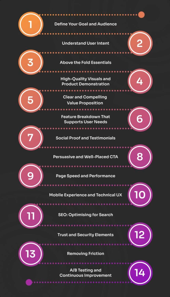
1. Define Your Goal and Audience
Before thinking about visuals or copy, you need to know exactly what the page should achieve and who it’s speaking to.
Start by defining one primary goal. Are you trying to get users to sign up for a demo, purchase a product, download a resource, or join a waitlist? A landing page can support secondary goals, but it should be designed around one main action.
Next, identify the audience this page is meant to attract. Different segments care about different outcomes. A first-time visitor might need education and reassurance. A returning visitor might want proof, pricing, or detailed comparisons. Senior decision-makers often focus on efficiency, impact, or ROI, while individual users may want simplicity or ease of use.
To define your audience with precision, review:
- Your ideal customer profile (ICP)
- Behaviour patterns gathered from analytics
- Feedback from sales and support teams
- The pain points or motivations that consistently appear in conversations
This step sets the direction for the entire page. Once goals and audience are clear, every other decision becomes easier and more intentional.
2. Understand User Intent
User intent is the compass of the landing page. It determines what someone expects to see the moment the page loads. If the page opens with something that doesn’t match what they came for, conversion drops.
Visitors fall into three groups:
- Problem aware: they know the pain but not the solution
- Solution aware: they’re comparing options
- Product aware: they already know your brand
Each stage requires a different depth of detail, tone, and persuasion.
To understand intent more accurately, analyse:
- Search terms and queries leading to your page
- Common questions from sales conversations
- Competitor messages your audience keeps seeing
- Repeated pain points in your ICP
When the messaging matches intent, the page feels relevant from the first line and naturally guides the user forward.
3. Above the Fold Essentials
The above-the-fold area determines whether users stay long enough to engage. You have only a few seconds to communicate value and set expectations. Research from Nielsen Norman Group shows that the first 10 seconds on a page influence whether a user commits to reading further.
A strong above-the-fold section includes:
- A benefit-led headline that instantly explains the value
- A subheadline that adds clarity without filler
- Visuals that show the product instead of describing it
- A clear CTA for users ready to take action
- Minimal navigation to keep focus
This section works as a promise. If it’s relevant, simple, and visually clean, users commit to reading more; but if not, they leave.
4. High-Quality Visuals and Product Demonstration
People understand images faster than text. High-quality visuals help users imagine the product in their own workflow or lifestyle, which shortens the decision-making process.
Effective formats include:
- Real product photos
- Short demo or explainer videos
- Interactive previews for complex tools
- Simple animations showing how a feature works
Good visuals reduce cognitive load because they explain things at a glance. When an image answers a question instantly, users feel more confident and move through the page with less effort. Paired with clear, concise copy, strong visuals make the decision-making process noticeably faster.
5. Clear and Compelling Value Proposition
A value proposition is a concise explanation of what the product does, who it’s for, and why it matters. It needs to be sharp enough to stand on its own.
A strong value proposition:
- Focuses on benefits, not just features
- Highlights what makes the product different
- Shows the practical impact on the user
- Stays grounded and believable
Senior decision-makers are rarely impressed by long feature lists because they care about outcomes. They want a clear sense of impact, speed, reliability, and return on investment, so your value proposition needs to make those benefits easy to understand.
If you want to explore this further, you can look into how storytelling shapes product marketing and influences buying behaviour.
6. Feature Breakdown That Supports User Needs
A feature list works best when it’s structured for scanning. Busy users don’t read long paragraphs – they scan headlines and icons first. Features should be structured into scannable sections. Icons, bullets, and short paragraphs make the content easier to digest.
Organise features into digestible blocks using:
- Short sections
- Bullet points
- Icons or simple visuals
- One-sentence explanations
Most importantly, relate each feature to a real outcome. “Automation” means nothing on its own, but “save hours every week by eliminating manual tasks” gives the reader a reason to care. Senior buyers understand tools, but they prioritise results.
7. Social Proof and Testimonials
Social proof builds confidence faster than any claim you make yourself. It shows that real people have tried the product and had a positive experience.
According to BrightLocal, more than 90 percent of people read reviews before buying. Even in B2B settings, people rely on evidence, not promises.
High-performing landing pages use:
- Customer testimonials
- Star ratings
- Review snippets
- Case studies
- Client logos
- Media mentions or industry recognition badges
These elements validate your offer, reduce hesitation, and give users a reason to trust what you’re saying.
8. Persuasive and Well-Placed CTA
Calls to action (CTAs) are where the decision happens. A good CTA is clear, predictable, and matched to the user’s readiness. Vague buttons don’t convert because they force people to guess what comes next, while clear CTAs remove friction and make the next step feel effortless.
Some of good examples of CTAs include:
- Get Started
- Try the Product
- Book a Demo
- See Pricing
Place CTAs at key moments throughout the page, but give each one a clear role. Early CTAs catch users who are ready to act right away, while later CTAs guide those who need more context before making a decision.
9. Page Speed and Performance
Even the best content can’t overcome slow loading times. Users expect pages to open quickly, and any delay increases the chance of abandonment. Google research found that when a page load increases from one second to three seconds, the probability of bounce increases by more than 30 percent.
In this step, key priorities include:
- Fast loading times
- Optimised images and scripts
- Efficient caching
- Minimal heavy elements that slow the page
Fast performance is one of the strongest trust signals you can provide, because a fast page sets the tone and keeps users engaged from the start.
10. Mobile Experience and Technical UX
A landing page needs to feel smooth and intuitive on every device. Buyers expect clear layouts, touch-friendly CTAs, clean typography, and strong accessibility features like alt text and good contrast.
Technical UX shapes how people view your brand, so if the interface feels clunky, they’ll assume the product works the same way.
Focus on:
- Clean, responsive layouts
- Touch-friendly buttons
- Legible fonts and comfortable spacing
- Strong accessibility and contrast
- Descriptive alt text for important visuals
A polished technical experience makes the page easier to trust and encourages users to continue exploring.
11. SEO: Optimising for Search
SEO ensures the right people find your landing page in the first place. Without it, even a great page struggles to gain traction.
Key areas include:
- Technical SEO: speed, indexing, mobile readiness
- Targeted keywords and natural keyword integration
- Well structured metadata: titles, descriptions, schema
- Strong internal linking
- Image compression and descriptive alt text
- Avoiding content duplication between landing pages and catalogue product pages
When optimised properly, a product landing page strengthens your wider e-commerce SEO strategy and helps attract consistent, high-intent visitors. Landing pages also help search engines and AI systems understand relevance more clearly, which is increasingly important as generative search becomes a bigger part of user behaviour.
12. Trust and Security Elements
Users convert when they feel safe. Removing uncertainty is one of the most reliable paths to higher conversions.
Include elements like:
- Transparent pricing
- Clear shipping and delivery timelines
- Straightforward returns or guarantees
- Security badges
- Warranty information
Trust signals reduce perceived risk and reassure buyers that the company stands behind the product. Even small details can influence behaviour at the moment of decision.
13. Removing Friction
Friction is anything that adds extra effort or slows the user down, and it can undermine an otherwise strong landing page. Too many choices, unclear steps, or unnecessary details can easily derail conversions.
You can reduce friction by:
- Shortening forms
- Reducing clicks
- Removing clutter
- Simplifying navigation
- Keeping the flow predictable
A friction-free page feels natural to use because it guides visitors through a clear story from top to bottom. Each section leads into the next, encouraging users to keep moving without hesitation.
14. A/B Testing and Continuous Improvement
The first version of your landing page is never the final one. High converting landing pages evolve and small, consistent tests lead to meaningful improvements.
Test variations of:
- Headlines
- Visuals
- CTA copy and placement
- Layouts and section order
Use behaviour data from heatmaps, scroll depth, and conversion tracking to understand how visitors interact with the page. Refine the messaging based on real patterns, not assumptions. Psychological triggers, such as reducing perceived effort or emphasising social validation, often make a difference.
Once the page itself is built, the next question is how it fits into your wider marketing efforts and supports the results you’re working toward.
Key Takeaways
A high-performing product landing page starts with a clear goal and a defined audience. When you understand what users want and why they’ve arrived, the entire structure becomes easier to shape. Match your messaging to user intent, keep the above-the-fold section focused on value, and use strong visuals to reduce effort and explain the product quickly.
A clear value proposition and well-organised features help users see the real benefits, while social proof and transparent details remove hesitation. CTAs should appear where intent peaks, supported by fast performance, smooth mobile experience, and clean technical UX.
Finally, treat your landing page as an evolving asset. Reduce friction wherever possible, build trust through clarity, and rely on continuous testing to refine the flow. These fundamentals work together to create a page that feels intuitive, credible, and ready to convert.
How Product Landing Pages Strengthen Your Marketing Campaigns
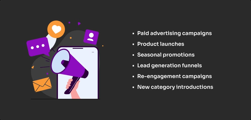
Product landing pages shine in situations where clarity, focus, and speed directly influence results. They work best when you need to control the message, remove distractions, and guide users toward one specific action.
They are especially effective for:
- Paid advertising campaigns – where every click is valuable and users need a clear path forward.
- Product launches – that require a strong narrative and a dedicated space to introduce benefits and use cases.
- Seasonal promotions – where urgency, limited-time offers, and clear CTAs drive higher conversions.
- Lead generation funnels – that rely on precise messaging, value-driven structure, and minimal friction.
- Re-engagement campaigns – targeting customers who already know your brand but need a focused reminder of value.
- New category introductions – where education and story-driven content help users understand a product they haven’t seen before.
Product landing pages also work well when you’re testing new angles, value propositions, or audiences. Because the page is isolated from the rest of the website, it becomes easier to measure performance and tailor the experience.
Most importantly, landing pages pair seamlessly with a strategic e-commerce marketing plan. They give your product the space it needs to convert traffic from ads, email campaigns, influencer collaborations, and organic search. Instead of sending users to a general product page filled with navigation options and competing elements, a landing page delivers a focused experience that moves them toward the next step.
To see how these principles work in real situations, it helps to look at brands that already use landing pages to convert consistently.
5 Good Examples of High Performing Landing Pages
High-performing product landing pages tend to follow similar patterns, even when they come from different industries. Strong structure, clear messaging, and a focused user journey consistently outperform pages that try to do too much.
Below are five examples that reflect these principles in action:
1. Blume: Superfood Latte Mixes
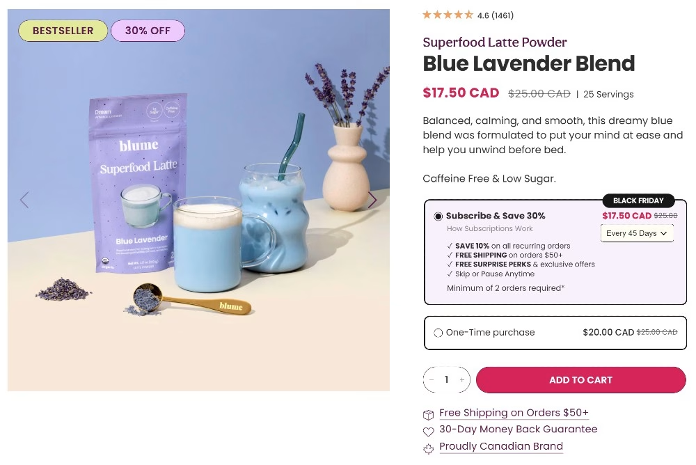
Blume is a small Canadian wellness brand that uses story-driven landing pages for each product.
Why it’s a good example:
- Friendly, human product descriptions
- Clear ingredient breakdown
- Emotional benefits (how it makes you feel)
- Strong UGC and reviews
- CTAs repeated in the right places
2. Brightland: Olive Oil Product Landing Page

Brightland is an independent premium food brand known for its clean aesthetic and carefully crafted product storytelling.
Why it’s a good example:
- Strong value proposition and narrative tone
- Beautiful visuals and real-world use cases
- Transparent ingredients
- Minimal, clean layout
- Strong trust signals (press, awards, reviews)
3. BALA: Wearable Fitness Weights
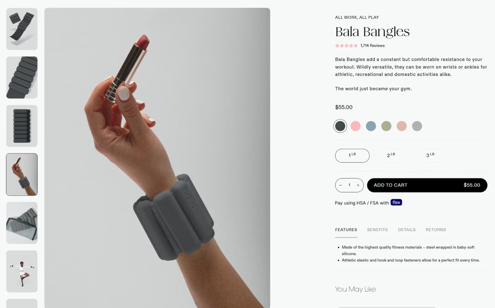
Bala is a small fitness brand with simple, polished D2C landing pages.
Why it’s a good example:
- Simple hero section with clean visuals
- Benefits before features
- High-quality product photos
- Clear sizing and colour options
- Social proof and real customer imagery
4. Pela Case: Eco-Friendly Phone Case Landing Page

Pela Case is a small sustainable brand with simple, clear landing pages built around benefits and problem-solution framing.
Why it’s a good example:
- Clean hero section with one clear message
- Strong visuals that explain the product without reading
- Simple feature breakdown
- Social proof woven naturally
- Trust elements like sustainability proof and guarantees
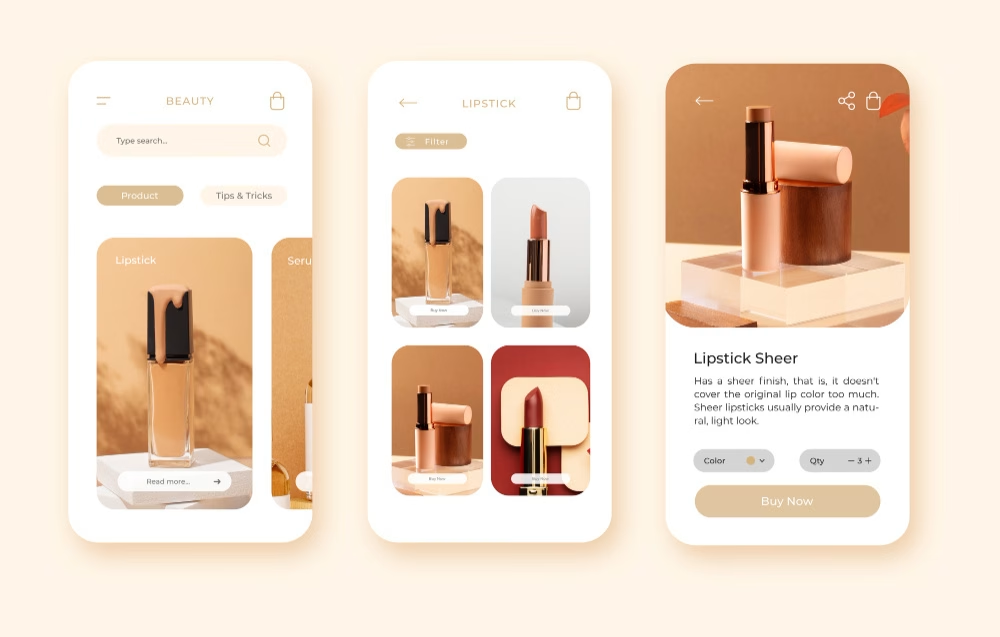
5. Miter: Ginger IT Example
Miter is a strong example of how product clarity and thoughtful visual organisation build confidence. Everything feels purposeful, which helps users understand the offer quickly and encourages them to continue exploring.
Miter specialises in organising their products into clear, accessible categories, which makes the shopping experience feel practical and effortless.
Why it works well:
- Smart spacing that makes product categories easy to scan
- Intuitive navigation that supports quick decision-making
- Clear, direct copy that highlights the value of each category
- Social proof that builds credibility without overwhelming the layout
- Transparent information that reduces friction and answers key questions
- A focused structure that aligns with user intent and avoids visual noise
What These Product Landing Pages All Have in Common
Across all these examples, several principles appear again and again:
- A sharp, benefit-led headline
- Strong visuals that communicate the product story instantly
- Clean layouts with minimal friction
- Clear pricing and visible trust signals
- Social proof that boosts credibility
- Thoughtful use of CTAs at the right moments
These patterns are consistent because user behaviour is predictable when information is structured well. When the message is clear, the flow is intuitive, and the visuals do part of the explaining, landing pages convert at a much higher rate.
Conclusion
A great product landing page is not about bells and whistles. It’s about clarity, trust, and an experience that respects the user’s time. When the messaging reflects user intent and the design removes friction, conversions grow naturally.
Landing pages work best when they’re part of a wider ecosystem – a website built on strong technical foundations, clear UX, and a consistent narrative. Companies that approach landing pages this way usually see stronger and more sustainable results.
This is where partnering with experts becomes valuable. A team with experience in e-commerce development and conversion-focused design can create the structure your product needs to perform consistently.
If you’re preparing a new product launch or want to strengthen an existing offer, now is a good moment to treat your landing page as a strategic asset. With thoughtful planning, strong copy, and intentional UX, it becomes the entry point to how customers understand your product and your brand.
If you’d like support in creating a landing page that performs at this level, you can reach out to our team at Ginger IT Solutions. We’d be happy to help you add a bit of extra spark and character to help it stand out.

