Web design trends in 2026 are less about “what looks cool” and more about what removes friction, builds trust quickly, and fits the way people actually browse today: half-attentive, constantly switching between devices, and increasingly assisted by AI.
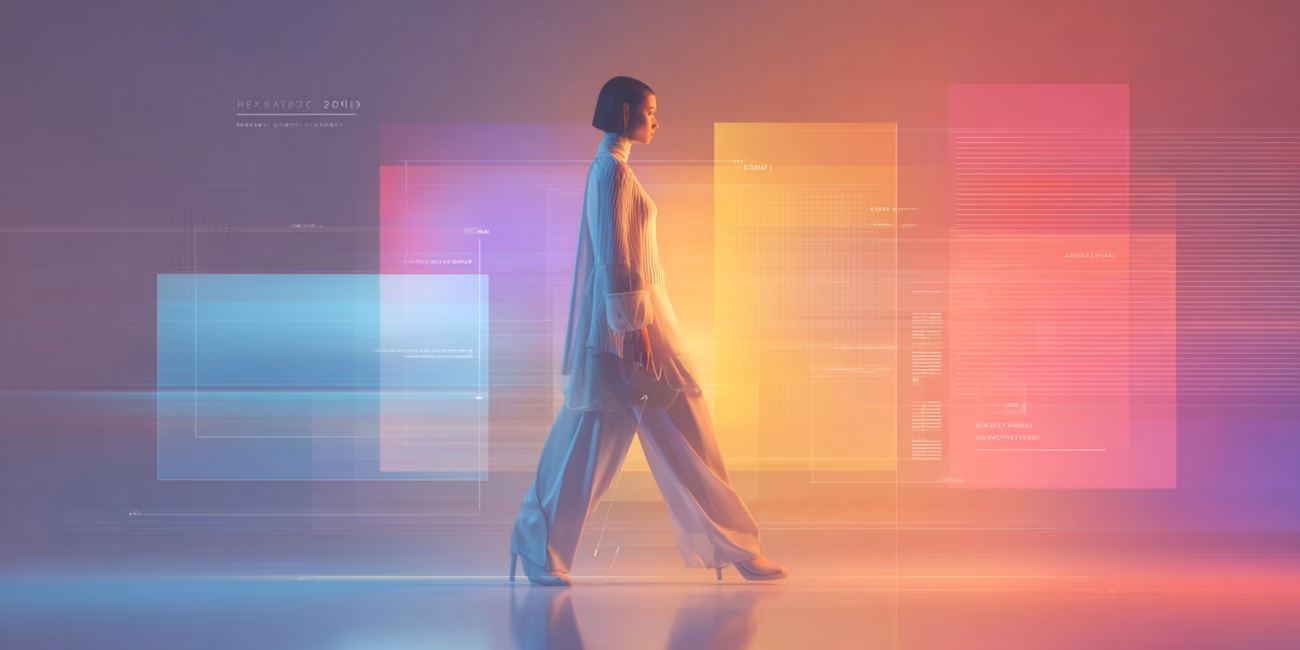
While last year leaned into hyperreality, elevated brutalism, maximalism, and playful storytelling, the direction for 2026 feels more focused and personal. Sure, AI is still very much part of the picture, but instead of turning websites into cold, machine-led spaces, designers are using it to introduce warmth, character, and a clearer sense of intention. There is a visible shift toward designs that feel human, slightly imperfect, and confident enough to show personality.
The central theme tying 2026 trends together is this move from purely visual design toward experiences that feel human and meaningful. It marks the beginning of a slow but necessary evolution toward more human interfaces, as if the industry is collectively acknowledging that we are no longer designing only for screens, metrics, and algorithms. Websites are being designed for people, their behaviour, their expectations, and their instincts.
In 2026, websites will begin to truly interact with visitors through all senses. They will listen, respond, adapt, and guide. Thanks to rapid advances in AI, elements like presence, motion, sound, and context can now be translated into a clear design language that feels intuitive and responsive rather than mechanical.
Yes, websites still need to be fast, smart, and effective at generating leads and selling products. That has not changed. What has changed is the bar. Users now expect experiences that are inclusive, immersive, and unmistakably human.
The goal is no longer just efficiency, but meaningful connection. Websites are evolving into spaces where the digital experience feels natural, intuitive, and aligned with how people actually think, feel, and decide.
TL;DR: Quick Summary of the 2026 Web Design Trends
- Layouts loosen up with organic shapes, soft gradients, and flexible grids that add warmth without sacrificing structure.
- Sustainability and ethics become performance fundamentals, pushing lighter pages, cleaner code, and accessible design as the new baseline.
- Motion grows up, serving clarity and feedback through functional micro-interactions instead of decorative animation.
- Hero sections act like mini-products, combining bold visuals, interaction, and clear CTAs to pass the first trust test quickly.
- Brand storytelling replaces generic brand claims, using narrative, proof, and constraints to build credibility and context.
- Video becomes a core homepage tool, used intentionally to explain, demonstrate, and reinforce confidence without hurting performance.
- AI reshapes both production and experience, enabling faster iteration and adaptive personalization based on intent, not identity.
- Agent-driven interfaces help users get things done, reducing navigation friction by guiding users toward outcomes.
- Cute-alism softens rigid systems, blending playful details with strong structure to reduce friction and humanize interfaces.
- Monochrome palettes with sharp accents fight visual fatigue and make decision paths clearer.
- Nostalgic design makes a comeback, reacting against sterile UI with expressive, early-web-inspired aesthetics used carefully.
- Frosted, glass-inspired UI adds depth and polish, as long as readability and contrast remain a priority.
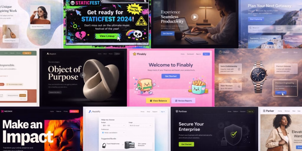
12 Major Web Design Trends in 2026
The following web design trends define how websites in 2026 are evolving from static visuals into more adaptive, human-behaviour-driven digital experiences:
1. Organic Shapes, Soft Gradients, and Flexible Layouts
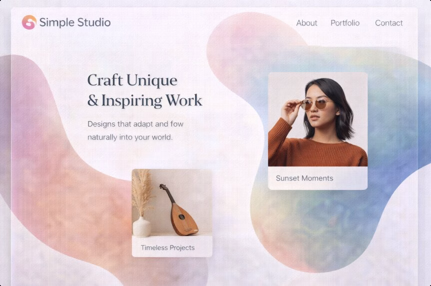
Design is loosening up. In 2026, expect more fluid shapes, soft gradients, layered depth, and layouts that gently bend the grid instead of strictly adhering to it. The structure is still there, but it feels less rigid and more expressive.
A decade of hard-edged minimalism trained users to expect clarity and competence, but not necessarily personality. Today, brands need warmth and distinctiveness without falling back into clutter or visual noise. Organic shapes help signal something that feels human-made, even when the product behind the interface is deeply technical or data-driven.
How to use it without making a mess:
- Keep the content hierarchy strict, even if the layout feels playful. Headlines, subheads, and CTAs should still follow a clear and predictable rhythm.
- Use gradients as lighting, not wallpaper. If a gradient competes with text or reduces readability, it is working against you.
Pro tip:
Let organic forms frame conversion elements. A soft shape behind a signup card or featured plan can guide attention naturally, without shouting for it.
Example of use:
A SaaS pricing page keeps its pricing cards neatly grid-aligned, but introduces soft gradient shapes behind the “Most popular” tier and customer proof sections. The result is visual flow and emphasis, while the page remains easy to scan and compare.
2. Sustainability and Ethics in Web Design
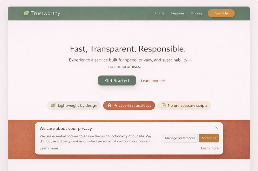
This approach focuses on design choices that reduce waste and unnecessary load: lighter pages, fewer non-essential scripts, efficient media usage, cleaner information architecture, and more responsible data practices. Ethical design also means building with accessibility in mind, being clear about privacy, and avoiding manipulative dark patterns that erode user trust.
Sustainability is no longer something confined to a CSR page. The digital sector’s environmental footprint is being measured more seriously, and the rapid growth of AI-driven infrastructure is pushing energy consumption higher. An ITU and World Bank report estimates that the ICT sector contributes at least 1.7% of global emissions, a conservative figure. Reuters has also reported ITU findings showing that big tech’s indirect emissions are rising as AI adoption accelerates.
There is also a very practical side to this. Heavy websites are expensive websites. Performance waste turns into real business costs, including slower user experiences, weaker SEO signals, and lost conversions. Google has long highlighted the relationship between speed and bounce rates, noting that when load time increases from one second to three seconds, the probability of a bounce rises by 32%.
How to apply it:
- Audit overall page weight and JavaScript usage. The 2024 Web Almanac notes that median JavaScript requests remain high and continue to grow.
- Replace autoplay video with click-to-play previews where it makes sense for the user and the content.
- Compress images properly, use modern formats, and ship less code wherever possible.
Pro tip:
Sustainable design is essentially a performance strategy wearing a moral outfit. Even teams that do not prioritise environmental impact care deeply about conversion drops caused by slow pages.
Example of use:
A product-led business removes third-party widgets from key landing pages, defers non-essential scripts, and replaces heavy background video with a lightweight animation that preserves the visual feel without the performance cost.
3. Micro-interactions and Purposeful Motion
These are small, intentional animations that provide feedback and guidance: button states, form validation, progress indicators, subtle transitions, hover cues, and interactive hints. In 2026, motion is less about visual flair and more about helping users understand what is happening on the screen.
Motion is finally being used like signage. Instead of decorating interfaces, it guides attention and confirms actions. Some designers describe this shift as functional animation, where movement supports clarity and confidence rather than slowing users down or competing with the content.
Our designer Kristina shared her perspective on this trend:
“Micro-interactions are one of the most exciting trends for me because of their very practical value. They directly help users find their way around a website more easily. Through small but clear responses, the interface provides real-time feedback, reduces uncertainty, and makes the overall experience feel more natural and intuitive. When used with the right balance, micro-interactions quietly guide users through the digital experience, without forcing them to think about what the next step should be. This approach really resonates with me, because it shows that design can and should have a clear purpose, working in the user’s favour rather than existing purely as a visual embellishment.”
How to use motion for function over flash:
- Make state changes unmistakable: loading, success, error, selected, and disabled states should be immediately clear.
- Use motion to reduce uncertainty during multi-step flows such as checkout, booking, or onboarding, where users need reassurance that they are on the right path.
- Respect accessibility by supporting reduced-motion preferences and avoiding unnecessary or disorienting effects.
Pro tip:
If an animation does not communicate status, hierarchy, or direction, it is likely just consuming performance budget without improving the experience.
Example of use:
A multi-step lead form uses a visible progress bar, instant inline validation, and a calm success confirmation animation that reassures users their request was successfully submitted.
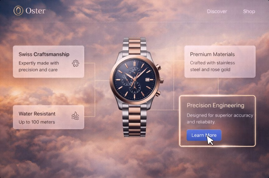
4. Expressive, High-impact Hero Design
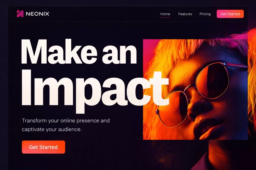
Hero sections are increasingly behaving like mini-products rather than simple visual headers. They combine abstract illustrations, deconstructed layouts, bold typography, subtle interactivity, and immediate next-step CTAs to communicate value within seconds.
Users decide quickly whether a site is worth their attention. The hero is no longer just a decorative entry point. It is the first trust test and the first clarity test, setting expectations for everything that follows.
How to make a hero that converts:
- Start with one strong central idea, whether that is a product visual, a distinctive illustration, or a headline that makes a clear, confident claim.
- Keep the primary CTA obvious and support it with short microcopy that removes hesitation.
- Use motion carefully. Performance is part of the hero’s job, not a secondary concern.
Pro tip:
Awe without orientation quickly becomes confusion. If the hero is visually expressive or complex, the copy needs to be even clearer and more direct.
Example of use:
A luxury real-estate development website features a cinematic hero with a concise value proposition, interactive highlights of key amenities, and two clear CTAs: “See availability” and “Download brochure.”
5. Brand Storytelling: Narrative-led Brand Design
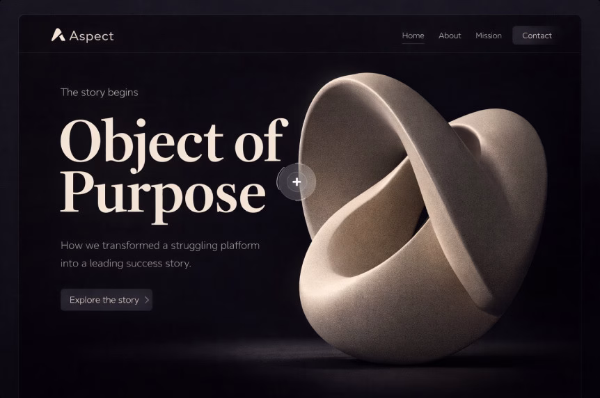
Less generic “We are passionate” copy, more narrative structure. In 2026, brand storytelling is built around clear context: the problem, the proof, the tension, the decisions made, and the outcome. Design plays a supporting role by shaping pacing, guiding the scroll, and using visuals to reinforce the story rather than distract from it.
Trust is the scarcest resource online, especially for premium services and high-ticket offers. Storytelling helps a website earn attention long enough to explain real value, without forcing visitors to read a novel or sift through vague claims.
How to make storytelling conversion-friendly:
- Make every section answer a real buyer question, such as “Why you?”, “Why now?”, and “What changes after purchase?”
- Build proof directly into the narrative through metrics, screenshots, before-and-after comparisons, testimonials, and recognizable client logos (when permitted).
Pro tip:
A story becomes more credible when it includes constraints. Saying “Here is what we chose not to do and why” signals experience, judgment, and confidence.
Example of use:
An agency case study walks through the messy reality of a project: the initial metrics, the UX problems uncovered, the decisions made along the way, and the measurable results achieved.
6. Embedded Video As a Core Homepage Element
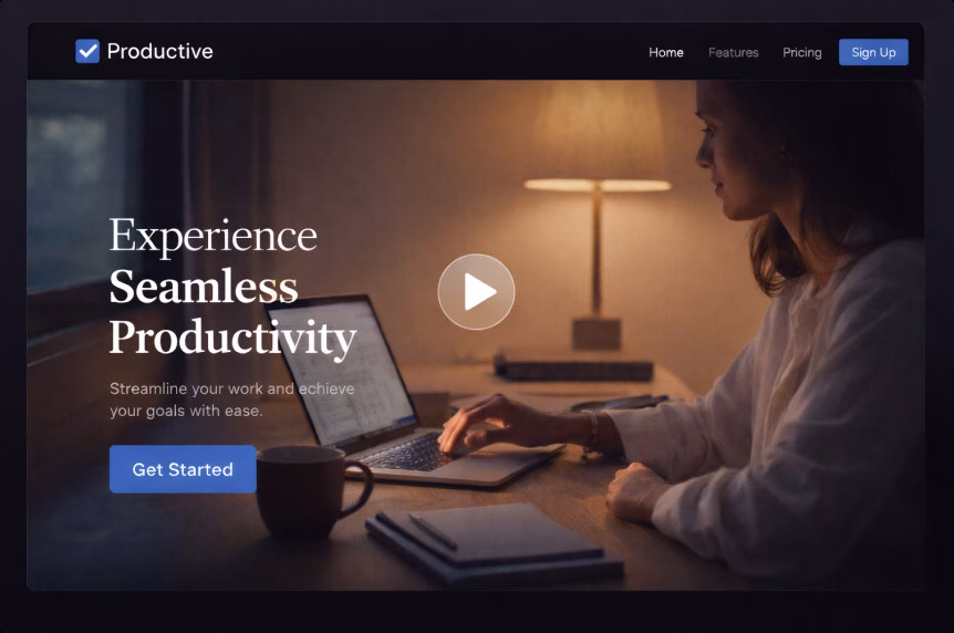
Video is becoming a core part of the homepage narrative rather than an add-on. It is used to show products in action, provide behind-the-scenes proof, share founder messaging, or deliver quick explainers. This approach is often paired with strong CTAs, thoughtful scroll behaviour, and layouts that guide attention without overwhelming the page.
Video reduces explanation time significantly. It can replace long blocks of text and communicate credibility, scale, or process much faster. The trade-off, however, is performance and the risk of distraction if video is overused or poorly implemented.
How to avoid the usual video mistakes:
- Use lightweight formats, lazy loading, and keep autoplay muted, or avoid autoplay entirely on mobile devices.
- Add captions and transcripts to support accessibility and silent viewing.
- Make sure the page still works and remains clear even if the video fails to load or is skipped.
Pro tip:
Place a video where it answers a real buyer question, such as “What is this?”, “How does it work?”, or “Can I trust you?”. Avoid using video purely as background decoration unless the site can comfortably handle the performance cost.
Example of use:
A manufacturing company homepage features a short, captioned “process” video near the fold, supported by a clear CTA to request a quote and a link to download a technical datasheet.
7. AI-powered Projects and Personalization
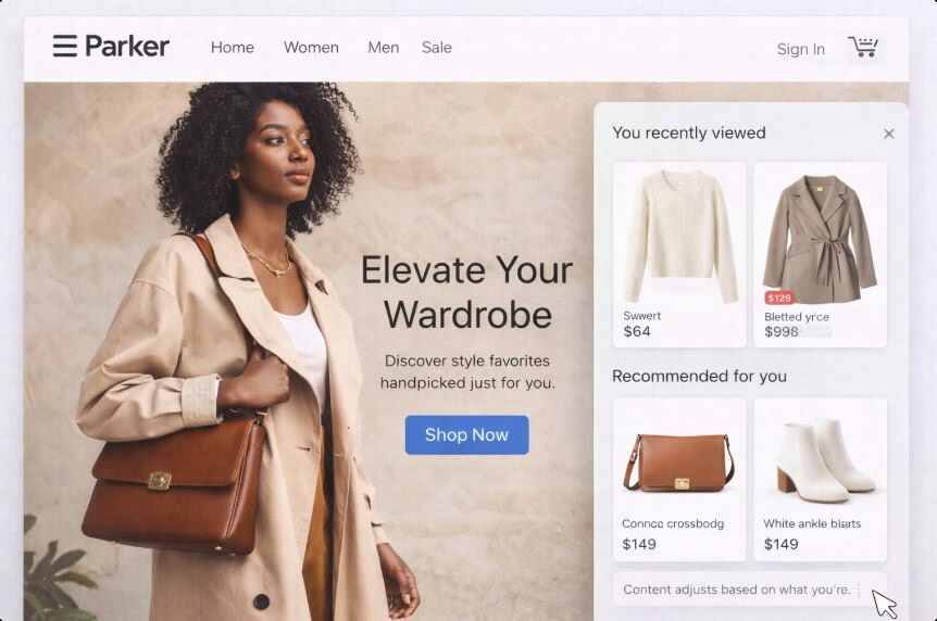
AI now shows up in web design in two distinct but connected ways. On the creative and production side, it supports faster prototyping, content variations, testing, and component generation. On the experience side, it enables adaptive interfaces that adjust content based on user intent, context, or behaviour rather than relying on one static version of a page.
The traditional static site model is starting to show its limits. Audiences segment and shift faster than teams can realistically publish new pages. AI helps close that gap by generating controlled variants, while personalization makes a website feel present and responsive instead of fixed and outdated.
How to do personalization without crossing the line:
- Personalize based on session intent, not personal identity. For example, “Looking for pricing?” versus “Looking for case studies?” reflects behaviour, not surveillance.
- Keep changes explainable. A message like “Recommended for teams like yours” should always be backed by visible, understandable logic.
- Avoid overfitting. A poorly targeted personalized experience can feel confusing or intrusive and is often worse than a neutral one.
Pro tip:
Start with personalization that is essentially better UX. Remembering a user’s last chosen location, currency, language, or product category often delivers the biggest benefit with the least risk.
Example of use:
A B2B service website adjusts its hero CTA based on the entry point. Visitors arriving through pricing-related searches see “Get a quote,” while those coming from case studies are guided toward “See results.”
8. Agent-driven Web Experiences
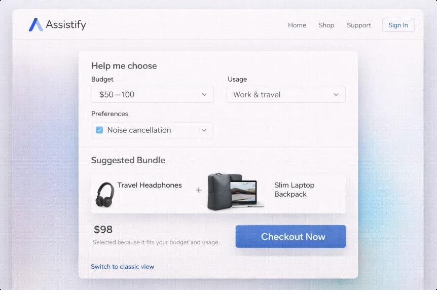
These are websites that actively work for the user. Instead of pushing people through endless menus and filters, the interface helps them complete tasks directly: comparing options, pre-filling forms, scheduling appointments, assembling a quote, building a cart, generating a brief, or simply finding the right product faster.
Users are becoming comfortable with conversational and assistant-driven workflows through tools like ChatGPT and AI-powered search. As a result, patience for “hunt and peck” navigation is shrinking. Agentic UX is essentially the website saying, “Tell me your goal, and I’ll help you get there,” without forcing users to figure out the path themselves.
How to implement it responsibly:
- Start with one high-value job to be done, such as “Find the right plan,” “Book the right appointment,” “Get a quote,” or “Build a cart under a specific budget.”
- Keep the agent’s actions transparent. If products are filtered, show the filters. If a form is drafted, make the fields visible and editable.
- Always provide an easy escape hatch back to classic navigation and manual control.
Pro tip:
Treat agentic features as a layer on top of solid information architecture, not a replacement for it. When the assistant falls short, the site still needs to function clearly and reliably.
Example of use:
An e-commerce site introduces a “Help me choose” flow that asks three to five simple questions, then builds a recommended bundle and explains why each item was selected, helping users feel guided rather than pushed.
9. Cute-alism: Where Cute Meets Structure
Cute-alism is a strange but surprisingly effective mashup. It blends kawaii-inspired details such as friendly icons and playful micro-illustrations with a brutalist structural backbone built on simple layouts, strong contrast, and utilitarian blocks. The result feels approachable without sacrificing clarity or control.
Brands increasingly want to feel human and relatable without drifting into generic or overly soft design. Cute-alism adds warmth and personality, while the underlying brutalist structure keeps the interface functional, readable, and easy to navigate.
How to use it without looking childish:
- Use cute elements as accents rather than foundations. Empty states, onboarding hints, and confirmation screens are ideal places for this kind of visual tone.
- Keep typography, spacing, and layout disciplined so the overall system remains clear and intentional.
Pro tip:
Cute elements work best in moments of uncertainty. Error states, form validation, and waiting screens benefit most, as gentle visuals can reduce perceived friction and anxiety.
Example of use:
A fintech dashboard maintains a strict layout and serious typography, but introduces soft character illustrations for empty states and subtle success animations after user actions.
10. Monochromatic Websites With One Sharp Accent

This approach relies on mostly single-tone palettes or tightly constrained neutrals, paired with one intentional accent colour used for priority elements such as CTAs, active states, key icons, and important highlights. The overall effect is calm, focused, and deliberate.
It works as an antidote to visual fatigue. With fewer competing colours on the page, users process information more easily and make decisions faster. The accent colour becomes a clear visual signal for what matters most, rather than just another decorative element.
How to do it well:
- Use the accent colour sparingly, consistently, and with a clear purpose, whether that is action, selection, or priority.
- Support the system with micro-illustrations and subtle micro-animations so the interface still feels expressive and human, not flat or sterile.
Pro tip:
If everything pops, nothing pops. Limit the accent colour to one or two UI roles, then apply that rule consistently across the entire interface.
Example of use:
A B2B cybersecurity website uses a mostly grayscale palette with a single vivid accent colour reserved for CTAs, hover states, and key trust badges, keeping attention focused where it matters most.
11. Dial-up Delight: Nostalgic Web Revival
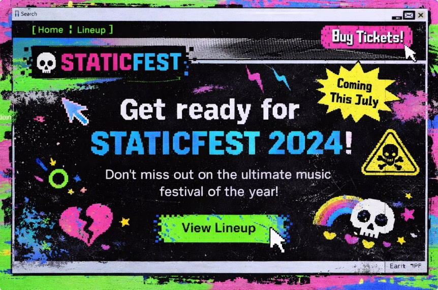
Dial-up delight leans into nostalgic chaos. It draws from early web aesthetics, pixel-inspired graphics, playful cursor interactions, loud typography, and intentional messiness. The style is often described as cutesy but goth, cyber-futuristic with an underground, grunge-like edge that feels raw rather than polished.
Gen Z nostalgia has become increasingly productized, but this trend is not limited to younger audiences. Many users respond positively to experiences that feel less like a template and more like a moment in time. Dial-up delight is a direct reaction to years of sterile, interchangeable UI design.
How to keep it usable:
- Keep the “mess” visual, not structural. Navigation, hierarchy, and content architecture should remain familiar and predictable.
- Accessibility still applies. Contrast, focus states, keyboard navigation, and readability must work properly, regardless of how chaotic the visuals appear.
Pro tip:
Treat this style like a campaign skin rather than a full product system. It works best for launches, events, and microsites, but can be risky for complex or utility-heavy applications.
Example of use:
A music festival website embraces a nostalgic aesthetic, while keeping ticket purchasing, schedules, and essential information clean, fast, and accessible.
12. Frosted Touch: Glass-inspired Interface Design
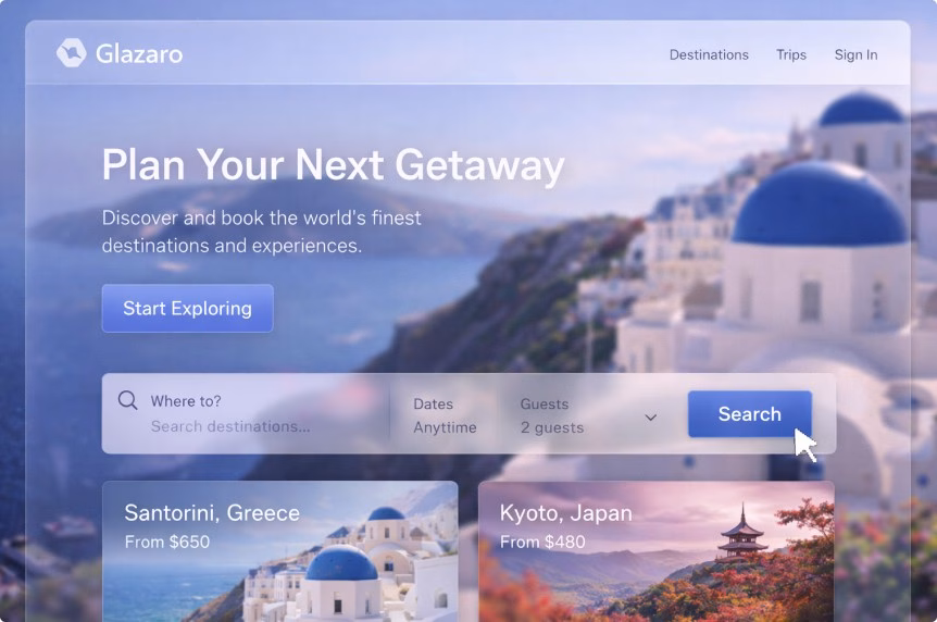
Frosted touch leans on glass-like surfaces, translucency, and diffused shadows. Think translucent panels, frosted overlays, layered depth, and soft shadows that create separation without heavy borders. This style sits within the broader glassmorphism family, but in a more restrained and practical form.
When used well, it feels premium and tactile, and it pairs naturally with gradients and depth-based layouts. Apple’s recent “Liquid Glass” direction has pushed frosted UI back into mainstream design conversations, while also exposing its biggest weakness: readability. Designers praised the visual polish, but many also raised concerns about legibility when transparency is pushed too far.
Our web designer Kristina’s refined sense of aesthetics comes through strongly in her take on this design direction:
“Frosted glass is something I’m especially drawn to on a visual level. It feels modern, elegant, and subtly different. It adds character and a sense of depth to the interface without relying on heavy or aggressive visual effects. When applied thoughtfully, it creates a strong first impression and makes the entire product feel more polished, intentional, and visually mature.”
How to use frosted UI without hurting UX:
- Frost should improve readability, not reduce it. Increase blur and lower transparency when text appears on top of busy backgrounds.
- Use it where visual separation matters most, such as panels, modals, navigation bars, and overlays.
Pro tip:
Test frosted elements on bright screens and low-quality monitors. If it struggles there, it will struggle in real-world conditions.
Example of use:
A travel booking website uses frosted filters and floating summary cards layered over photography-heavy backgrounds, while keeping all text on high-contrast surfaces for clarity.
When Design Stops Being Aesthetic and Starts Being Strategic

Following web design trends is not about chasing aesthetics for their own sake. It is about staying aligned with how people actually use the web and how platforms evolve.
Performance is a good example. Speed has a direct impact on bounce rates and conversions. Trends such as sustainable design, simpler visual systems, and more intentional motion are not just stylistic choices. They reduce unnecessary weight, improve responsiveness, and make sites feel faster and more reliable.
These same factors contribute to stronger SEO resilience. Discoverability is closely tied to user experience and performance, and search engines continue to reinforce this connection. Core Web Vitals and page experience signals push teams toward better performance discipline, while industry research, including studies from Backlinko, continues to examine how these metrics influence real user behaviour.
Trust is another area where modern design trends matter. Clear storytelling, proof-driven hero sections, and transparent UX patterns help reduce skepticism. In crowded markets full of similar offers, clarity and credibility become real competitive advantages, not just nice-to-have qualities.
Accessibility and inclusion have also moved from optional to essential. WCAG 2.2 became a formal W3C Recommendation in December 2024, raising the baseline for what is considered acceptable web experience. Design trends that ignore accessibility will age poorly, but more importantly, they already limit reach and usability today.
Finally, modern web design aligns more closely with how people research, shop, and make decisions. AI-driven search, multi-touch buying journeys, and constant device switching have changed user behaviour. Trends like agentic experiences and AI-powered personalization are responses to these shifts. They are not design fashion, but practical adaptations to how people now interact with digital products and services.
If you are a founder, marketing lead, or product owner, this is where web design trends stop being inspiration and start becoming operational decisions.
A Note Worth Making: Trends Are Easy, Outcomes Are Harder
A stunning, responsive, and functional website is never the result of simply adding a few trendy UI patterns. Real results come from the less glamorous fundamentals: solid research, clear information architecture, accessibility checks, performance budgets, ongoing testing, and a design system that holds up when real content and real users come into play.
This is where partnering with experienced web design professionals starts to make business sense. Teams that treat a website as an operating system for growth, rather than a one-time “pretty project,” approach design as a long-term investment.
At Ginger IT Solutions, web design work typically covers the full process, from discovery and wireframing to prototyping, design systems, usability testing, and building responsive experiences that support clear business goals. This kind of approach becomes especially important for teams building sites meant to grow, sell, and evolve over time.
When a website is also expected to sell, that same level of discipline needs to extend into e-commerce web development. This is where performance and UX decisions have a direct, measurable impact on conversion rates, customer confidence, and repeat purchases. Trends may set the direction, but outcomes are shaped by how well the foundations are built and maintained.
Wrapping Up
Expectations placed on websites have never been higher. A modern site is expected to function as a storefront, a sales representative, an onboarding experience, a support desk, and the brand’s non-verbal language at the same time. When a site is slow, confusing, or inaccessible, it is no longer just a design problem. It is a lost trust and lost revenue.
This is why web design trends in 2026 feel more grown up. The aesthetics will continue to evolve, but the more significant shift is responsibility. Websites now need to be fast, accessible, adaptive, and transparent in how they work.
More importantly, human-centered principles are what truly connect all 2026 web design trends. This quiet evolution will only accelerate as design tools mature and people grow more comfortable with intuitive, responsive ways of interacting online.
Trends like organic layouts and cute-alism are leading the charge in bringing humanity back into digital experiences. Frosted touch and awe-inspiring hero sections add a sense of premium presence. Agentic UX and AI-powered personalization reshape how users move from intent to action. Sustainable design keeps performance budgets under control while responding to very real environmental and operational pressures.
That said, do not be fooled. The teams that will win in 2026 are not the ones chasing every web design trend that appears. They will be the ones who choose a few trends that genuinely fit their audience, apply them with intention and restraint, and measure results over time.
In the end, successful websites are not collections of trends, but living ecosystems built to evolve, perform, and connect.
This article was created in collaboration with our talented web designer, Kristina Katona. Her hands-on insights and practical perspective helped shape how these trends are viewed, applied, and translated into real design decisions, including the pro tips shared throughout the article.

