
Most landing pages don’t fail because of traffic. They fail because they waste it.
Clicks are coming in. Campaigns are running. Analytics look busy. And yet, results don’t match the effort. The issue usually comes down to one thing: what happens after the click.
Conversion rate optimization (CRO) is where that gap gets fixed. It’s where growth compounds or quietly leaks away. A page can rank well, attract the right audience, and still underperform if it doesn’t guide visitors toward a clear action. That space between interest and decision is where most revenue is lost.
There’s no shortage of advice on what goes wrong. Poor layout, confusing navigation, inconsistent design. All valid. All worth fixing. But treating those as the finish line misses the point.
Conversion rate optimization isn’t about avoiding mistakes. It’s about building pages that convert on purpose. It comes down to clarity, structure, and intent, the elements that move someone from “just looking” to taking action.
This guide breaks down how conversion rate optimization for landing pages works in practice, focusing on what actually drives results.
Quick Summary
Conversion Rate Optimization turns attention into action through clarity, structure, and intent.
High-performing landing pages focus on one clear offer, for a specific audience, presented in a way that’s easy to understand and act on.
What drives results:
- a strong, relevant offer
- clear message hierarchy
- focused user flow
- compelling headlines and copy
- visible trust signals
- frictionless forms and CTAs
Small details matter too. Mobile experience, form length, and visual cues all influence how easily users move forward.
CRO is a system built on testing, learning, and continuous improvement. Better results don’t come from more traffic. They come from using the traffic you already have more effectively.
The One Job Every Landing Page Must Do Well
A landing page has one job: to move someone from interest to action.
At its core, a landing page exists to guide the visitor toward a clear next step. In most cases, that means one of two things: making a purchase or leaving their details. A sale or a lead.
This is where many pages lose focus. They try to educate, impress, and explain everything at once. The result is predictable: the visitor hesitates, scrolls, and leaves.
The data is consistent. Most landing pages convert between 2% and 5%, while top-performing pages exceed 10%.
Studies also show that reducing friction and focusing on a single action can lift conversions by 20% or more. Not because the offer changed, but because the path became easier to follow.
Conversion Rate Optimization Starts With the Offer

There’s a simple truth most teams learn too late: landing pages rarely lose conversions because of design. The offer drives the outcome.
Before colors, layouts, or animations even come into play, there’s one question every visitor is asking: Is this worth my time? If the answer isn’t clear within five seconds, they’re gone.
Teams polish visuals, adjust layouts, tweak spacing, while the core message stays vague. The offer does the heavy lifting. Design helps it get noticed.
A flawless page with a weak offer will underperform every time. A strong offer can carry a page that’s visually average.
A landing page isn’t the place to say everything. It’s where you present one clear value proposition that makes sense immediately.
HubSpot’s landing page makes this clear by stating exactly who the offer is for, removing any guesswork from the start.
Audience Clarity: If It’s for Everyone, It Converts No One

Trying to speak to everyone usually means connecting with no one.
It may feel like the safer choice: a broader audience, more potential customers. In reality, it weakens relevance and makes it harder for the right people to recognize themselves.
Conversion rate optimization depends on that moment of recognition. A visitor decides almost instantly whether something is relevant.
High-performing landing pages don’t try to cover every angle. They focus. They speak to a specific audience, use familiar language, and address a clear problem.
In practice:
- Define a narrow audience
- Use the language your customers actually use
- Solve a specific problem, not a broad category
There’s a reason many SaaS landing pages state exactly who they’re for in the headline: “For marketers,” “For small teams.” The visitor doesn’t have to figure it out – they simply recognize it.
Once they recognize themselves, the next question is whether the page makes sense. Recognition alone doesn’t convert. Clarity does.
Message Hierarchy: If They Have to Think, They Won’t Convert
Most landing pages don’t fail because something is missing. They fail because everything is competing.
Too many messages. Too many directions. Too much effort is required to understand what matters.
The result is hesitation. And hesitation rarely converts.
CRO depends heavily on structure. Not just what you say, but the order in which you say it.
Strong pages follow a simple flow:
- What this is
- Why it matters
- What to do next
Many pages lead with features, brand statements, or visuals that look impressive but don’t move the decision forward. The message becomes fragmented, and the visitor has to work to understand it. That’s usually where the decision breaks.
People don’t analyze landing pages. They scan them. If clarity isn’t immediate, they move on.
A simple test: give someone a few seconds, then ask:
- What is this page offering?
- Who is it for?
- What happens next?
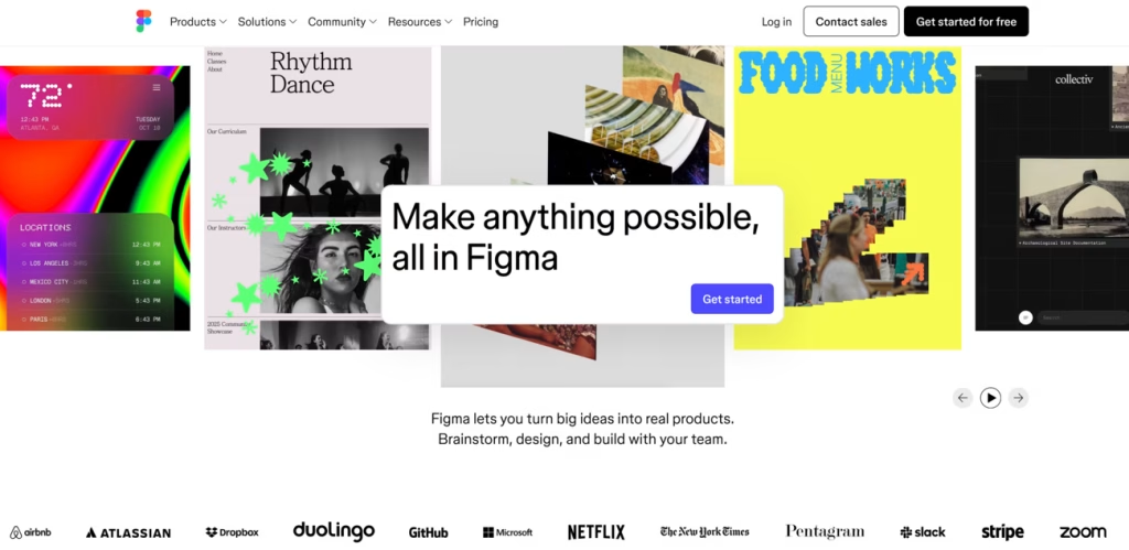
Figma is a strong example of this, making it immediately clear what the product is, what value it offers, and what the next step should be.
Once the structure is clear, the next layer is attention.
Good Design Looks Nice. Smart Design Converts.
Most conversion problems don’t start after launch. They start in the design phase.
CRO should be built into the foundation. The way a page is structured determines how attention flows and what users notice first.
This is where visual hierarchy matters:
- The primary CTA stands out immediately
- Supporting elements guide attention, not compete with it
- The layout follows natural reading patterns
When this is done right, the page feels intuitive. Web design teams that treat design as a strategic function tend to build pages that perform more consistently.
Most conversations stop at usability, but that’s only half the story. Usability ensures the page works; CRO ensures attention is directed where it matters.
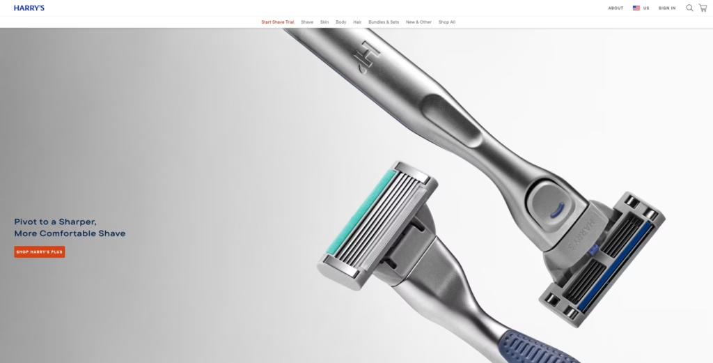
Harry’s website is a strong example of how thoughtful design guides attention and naturally leads visitors toward the next step.
If the Headline Doesn’t Work, Nothing Else Will
Most visitors won’t read the full page. In many cases, the headline is all they see. If your page had to rely on a single element, it would be the headline.
A strong headline does three things:
- Signals who the page is for
- Communicates a clear benefit
- Sets expectations
When those three pieces are clear, the visitor keeps reading.
Weak headlines tend to be vague, overly clever, or focused on the company instead of the user. The upside is that headlines are easy to test. Small changes can shift performance significantly:
- Problem-focused: “Struggling with X?”
- Outcome-focused: “Achieve Y in less time”
- Efficiency-focused: “Do X without Y”
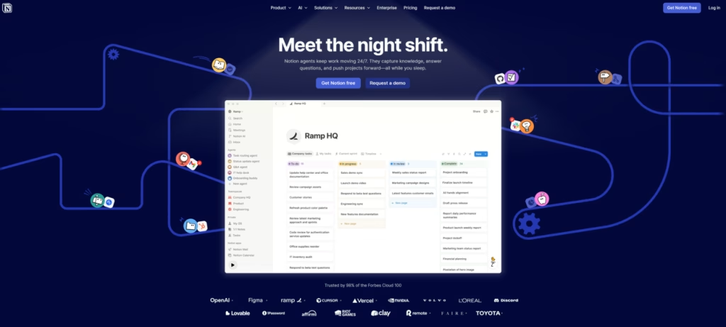
Notion does this well by using headlines that are simple, unexpected, and immediately engaging.
Once attention is captured, the next barrier appears: trust. Because getting someone to read is one thing, but getting them to believe you is another.
Trust Signals: If They Don’t Trust You, They Won’t Convert
Even the strongest offer doesn’t remove doubt.
A visitor might be interested. They might even be ready to act. But there’s always a moment of hesitation: Can I trust this? Is this worth the risk?
Trust signals exist to remove that friction. They don’t sell the offer, they validate it.
High-performing pages make credibility visible:
- Testimonials with real names, photos, and roles
- Case studies with clear, measurable results
- Client logos that signal familiarity and credibility
- Certifications, guarantees, or industry recognition
There’s strong evidence behind this. Various CRO studies have shown that credible testimonials alone can increase conversion rates by 20% or more.
Credible testimonials alone can lift conversions significantly. Because visitors aren’t just evaluating the offer; they’re deciding whether choosing you feels safe.
Mailchimp applies this effectively by placing trust signals directly in the hero section, reducing hesitation and reinforcing confidence with social proof from thousands of satisfied users.
CTA Strategy: The Moment That Decides Everything
Most teams treat the CTA like a finishing touch: change the color, tweak the size, maybe try a different label.
But the CTA isn’t decoration. It’s the moment where intent turns into action.
Strong CTA strategy is simple:
- Place a primary CTA where it’s immediately visible
- Repeat it where intent peaks
- Focus on one action
This is not about adding more buttons. It’s about removing hesitation.
Then there’s the wording. CTA copy has more impact than most expect. Generic labels like “Submit” or “Learn more” don’t give the user a reason to act.
Action-driven alternatives perform better because they make the result clear:
- “Get my free report”
- “Book your consultation”
- “See how it works”
At this point, the user isn’t asking what the button does. They’re asking what they get.
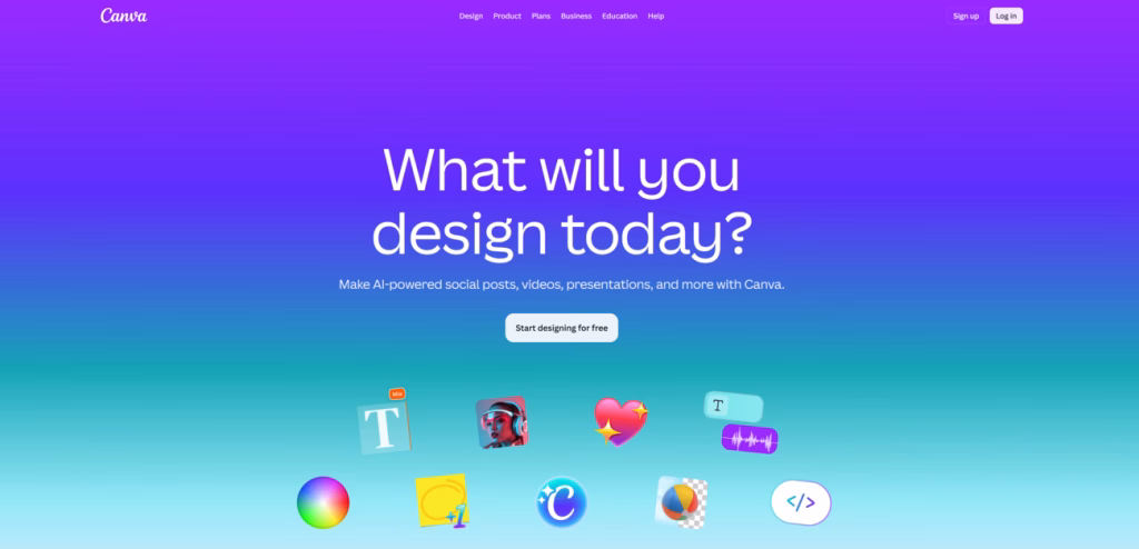
And if you can use the word “free,” like Canva does, even better.
In many cases, that action is tied to a lead magnet – a report, audit, or free consultation offered in exchange for contact details. When the value is clear, the form stops feeling like a request and starts feeling like an opportunity.
CRO and Copywriting: Design Gets Attention. Copy Gets Results.
Design draws the eye. Copy moves the decision forward.
Copywriting is one of the most underestimated drivers of conversion rate optimization. It carries the message, shapes perception, and ultimately determines whether someone takes action or leaves.
Translating a complex offer into clear, persuasive language is a skill that directly impacts conversion rates.
Strong landing page copy does a few things exceptionally well:
- Removes ambiguity
- Anticipates objections
- Reinforces value throughout
When this is done right, the page feels effortless to read. When it’s not, even a well-designed page starts to underperform.
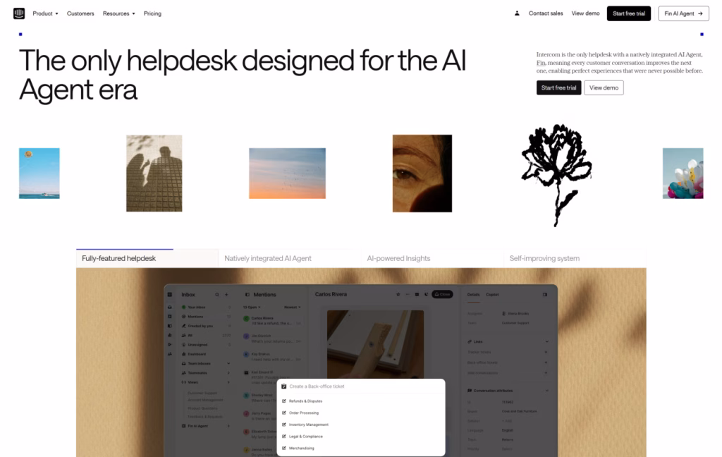
Intercom demonstrates this well by using copy that highlights long-term value, making the benefit both clear and compelling.
More Options, Fewer Conversions

A landing page is not a website – it’s a decision environment. The moment you add menus, extra links, or multiple directions, you introduce friction because users now have to choose.
The more options you present, the less likely someone is to take action.
That’s why high-performing landing pages are intentionally minimal. They remove anything that doesn’t support the primary goal:
- No full navigation menus
- No unrelated links
- No competing CTAs
What’s left is focus.
Allbirds executes this well by keeping the experience focused, while reinforcing trust through authentic voices like Elaine Welteroth.
What They Click Is What They Expect to See
Most conversion leaks don’t happen on the page. They happen in the gap between what the user clicked and what they expected to see next.
A user clicks based on a promise. The moment they land, they look for confirmation. If that connection isn’t immediate, trust drops.
This is especially critical in paid campaigns, where every click has a cost.
That consistency should carry across:
- Messaging: the core promise should feel the same
- Visual style: colors, imagery, and tone should feel familiar
- Offer details: what was promised in the ad should be clearly reflected on the page
A slightly different headline, a missing benefit, or a visual that doesn’t align can make the experience feel disconnected. And users don’t analyze that feeling. They react to it.
Conversion Details That Still Matter

Not every improvement comes from big structural changes. Some of the biggest gains come from small details that reduce friction at the edges.
1. Mobile Traffic Is High. Mobile Conversions Lag.
Most users arrive on mobile, but far fewer convert there.
The issue isn’t traffic. It’s the experience. What works on a desktop often breaks on a smaller screen, where attention is shorter and interaction is less precise.
On mobile, every element has to justify its presence, and every step has to feel effortless. If a page isn’t easy to scan, understand, and act on within seconds, users leave.
2. The Form Is Where Conversions Hesitate
Forms don’t fail because they exist. They fail because they ask for too much, too soon, or without clear justification.
Every additional field creates a small moment of resistance. The balance is simple: the value of your offer should justify the effort you’re asking for.
Keep it focused. Ask only for what’s necessary. If more information is needed, collect it later. For longer forms, break the process into steps so it feels manageable rather than overwhelming.
3. Design Tells Users Where to Look
Before a visitor reads a single word, their attention is already being directed.
Layout, alignment, and visual structure quietly shape how a page is experienced. Done well, they guide the eye toward what matters. Done poorly, they scatter attention and create friction.
Small cues make a bigger difference than most expect. The direction of a person’s gaze, the spacing between elements, or a subtle visual nudge can lead users exactly where you want them to go, without making it feel forced.
Glossier demonstrates this well by using clean, visually striking imagery to capture attention and subtly direct how visitors engage with the page.
Testing Framework: Optimization Is a System
Most landing pages are underperforming because they’ve never been properly tested.
Conversion rate optimization doesn’t happen in a single update or redesign. It’s built through iteration: small, deliberate changes that are measured, validated, and improved over time.
At its core, effective CRO follows a simple loop:
- Establish a baseline
- Test one variable
- Measure impact
A/B testing remains one of the most reliable ways to do this. The highest-impact elements to test are:
- Headlines
- CTA copy
- Page structure
- Visual hierarchy
These are the elements users interact with first, which makes them the fastest way to uncover improvements. Every successful test becomes your new baseline.
What Actually Drives Conversions

Most landing pages don’t underperform because of one big mistake. They underperform because no one is improving them consistently.
CRO isn’t a checklist you complete. It’s a system you build. Real growth comes from understanding how users think and refining accordingly.
The fundamentals remain:
- Start with a clear, compelling offer
- Remove friction wherever possible
- Guide users toward a single, obvious action
- Test, learn, and improve
Small gains compound into meaningful results. Because the best-performing landing pages aren’t finished. They’re continuously refined.
But conversion doesn’t depend on the page alone. It depends on who lands on it.
That’s where working with an experienced SEO agency, such as Ginger IT Solutions, makes a difference. When search intent, content, and conversion flow are aligned, performance improves across the board.
Traffic alone won’t fix a weak page. And a strong page won’t perform with the wrong audience.
Ready to Turn Clicks Into Results?
Most landing pages don’t need a redesign – they need clarity, structure, and the right decisions in the right places.
If you’re getting traffic but not results, there’s a gap somewhere in the experience.
Not always obvious. Always fixable.
If you want a clear view of what’s working, what’s not, and where the real opportunities are, let’s take a closer look. No guesswork, just focused insight into what’s holding your page back and how to improve it.
Feel free to contact us when you’re ready.

